Is Microsoft a sell? One of the most successful stocks over the past 10 years? Are you mad bro? The stock only goes up, in fact it’s been up 8 years in a row, even last year’s 20% market drubbing didn’t change that incredible record.
For the record: I have no position in $MSFT nor do I intend to, and this post is not to be taken as trading advice. I’m also not commenting on $MSFT’s fundamentals which look to be great, I’m just outlining some technical thoughts here, do with them as you wish.
But here goes:
As I outlined in Icarus Warning $MSFT is one of the big momentum stocks that has me cringe at technical risk.
The principle chart that has my attention is the yearly chart:
Yes a linear chart, but the point I’ve made before: Vast disconnect from the yearly 5 EMA. Nearly 28%. Hasn’t touched it in 2 years whereas previously it regularly reconnected with the 5 EMA in every year except in 1999 and at the beginning of 2000 before the tech bulb burst. Just a basic reconnect implies a 28% drop in the stock. To be bullish is to assume it just keeps going up despite all previous history. That’s what this chart tells me.
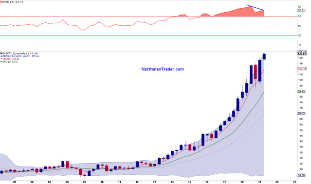
How about the quarterly chart?
Not as extreme, but still an 11% disconnect from the quarterly 5 EMA. $MSFT has been on such a tear in recent years it did not reconnect with its quarterly 5 EMA for several quarters in 2016 and 2017. It did so however twice in 2018 and these tags turned out to be support.
Note these new all time highs here: They come with a big negative RSI divergence.
That divergence is also notable on the daily chart:
The negative divergence history on the daily chart suggests eventual reconnect risk into the 50MA or lower.
The weekly chart gives us some structural perspective:
2018 saw a break of the 2016 trend. The rally in 2019 has formed a rising wedge underneath the broken trend line. That wedge is reaching its zenith. $MSFT, the stock, will have to make a decision soon. A break below the wedge would imply a move toward the 50MA as outlined in the daily chart.
So you see there are plenty of chart time frames that suggest risk to the downside. But momentum stocks are often impervious to any downside risk for longer than people can imagine and hence upside risk must also be considered and for that let me give you an upside risk view using fibonacci levels:
On the upside we can identify the 1.618 fib using the 2018 highs and lows as a base. That sequence suggests upside potential into 129.88. Given the larger picture any move between here and $129.88 could define a sell zone.
Are fibs relevant? Indeed they are. Looking at the fib chart above please note how precisely the December low was defined by the .236 fib at $94.19, an almost perfect tag. This fib is based on the 2010 lows and the 2018 highs suggesting $MSFT the stock is respecting these larger fib constellations.
In terms of larger downside risk the yearly 5 EMA at $89.56 has to be considered as does the $110 quarterly 5 EMA
So frankly $MSFT, in the big scheme of things, looks like a 5% upside versus 28% downside risk proposition to me. The stock is showing vast technical extensions and negative divergences. On a break of its rising wedge immediate risk would be into the 50MA at $115 and/or the quarterly 5 EMA at $110. Without such a wedge break the stock continues to have upside risk into $129.88.
$MSFT is reporting earnings Wednesday evening after market close.


